Merri City Sound
Category
Brand Identity · Logo Design · Visual Design
Client
Personal Project
Year
2024
My Role
Brand Designer
Merri City Sound is a music events company I co-run with friends, born out of the same neighbourhood, the same record collections, and years of putting on nights together. When the City of Moreland was renamed Merri-bek, we took it as an opportunity to do something we'd been putting off: build a brand worthy of what we do.
The Brief
We'd been operating as Moreland City Sound, a name tied directly to the suburb where we all grew up. When the local council renamed the area to Merri-bek in recognition of its Indigenous history, we embraced the change and became Merri City Sound. But a new name needed a new identity. The brief was personal: create something that felt local and earthy, rooted in the area and its history, while holding its own against the visual language of the modern music industry. No corporate polish. No generic DJ logo. Something with meaning underneath it.
My Approach
How I tackled it.
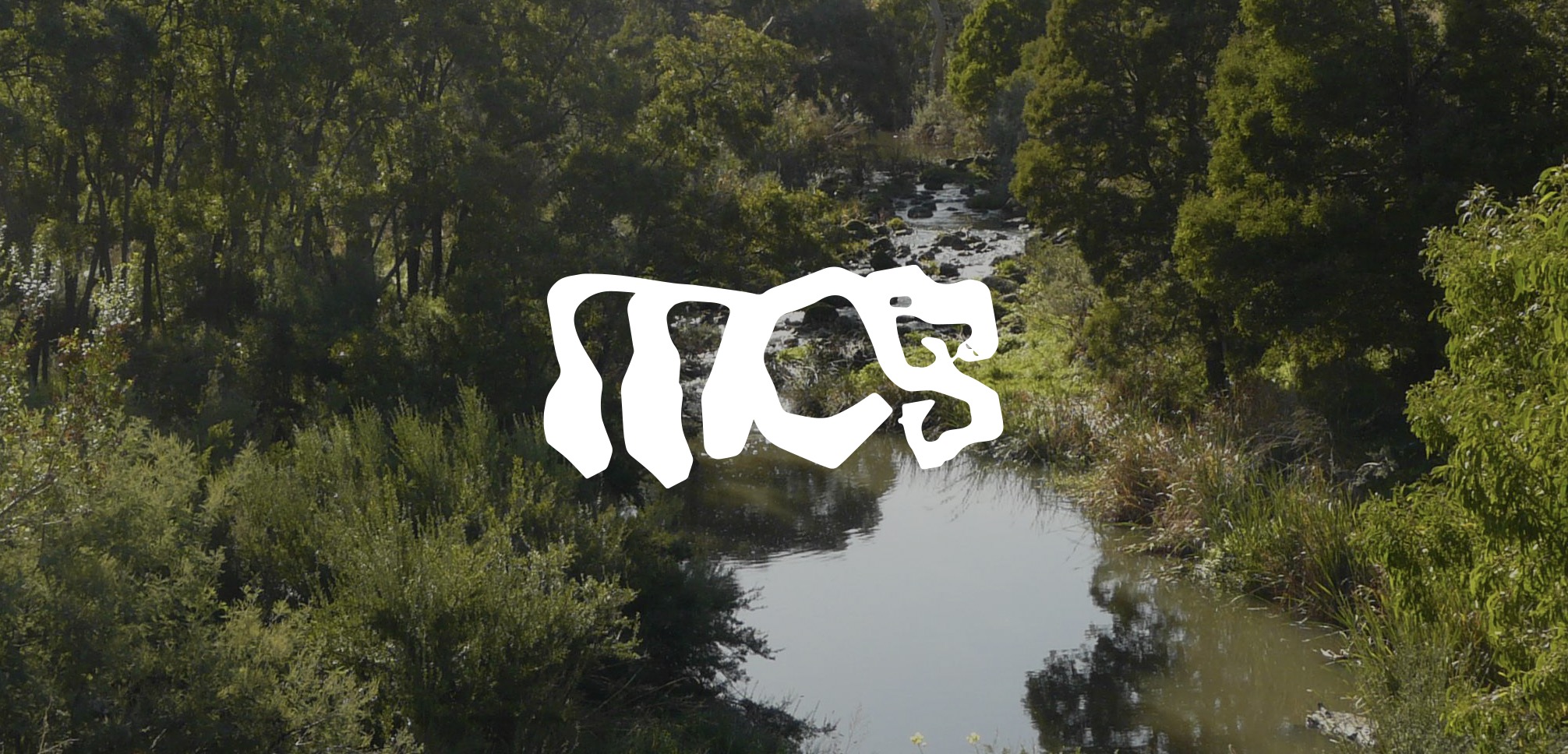
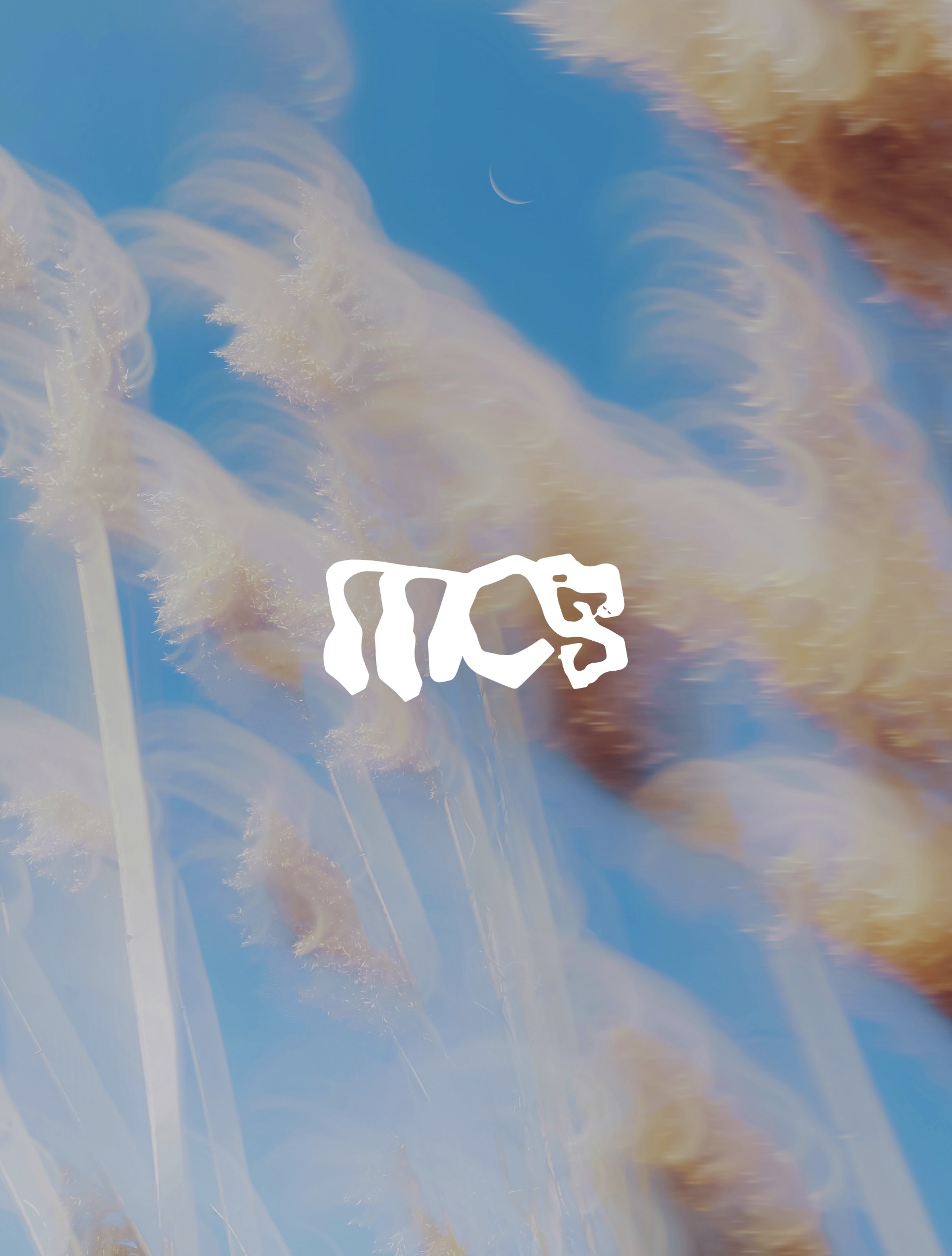
The identity is built around an abstract letterform, an abbreviated mark that works as both a logo and a standalone symbol. The form ties directly to the Merri Creek, the waterway that runs through our area and gives the rebrand its sense of place. Look closely at the letterform and you'll find a subtle snake embedded in the design, a nod to the creek, to the land, and to the Indigenous history that the renaming was meant to honour. It's not decorative. It's intentional.
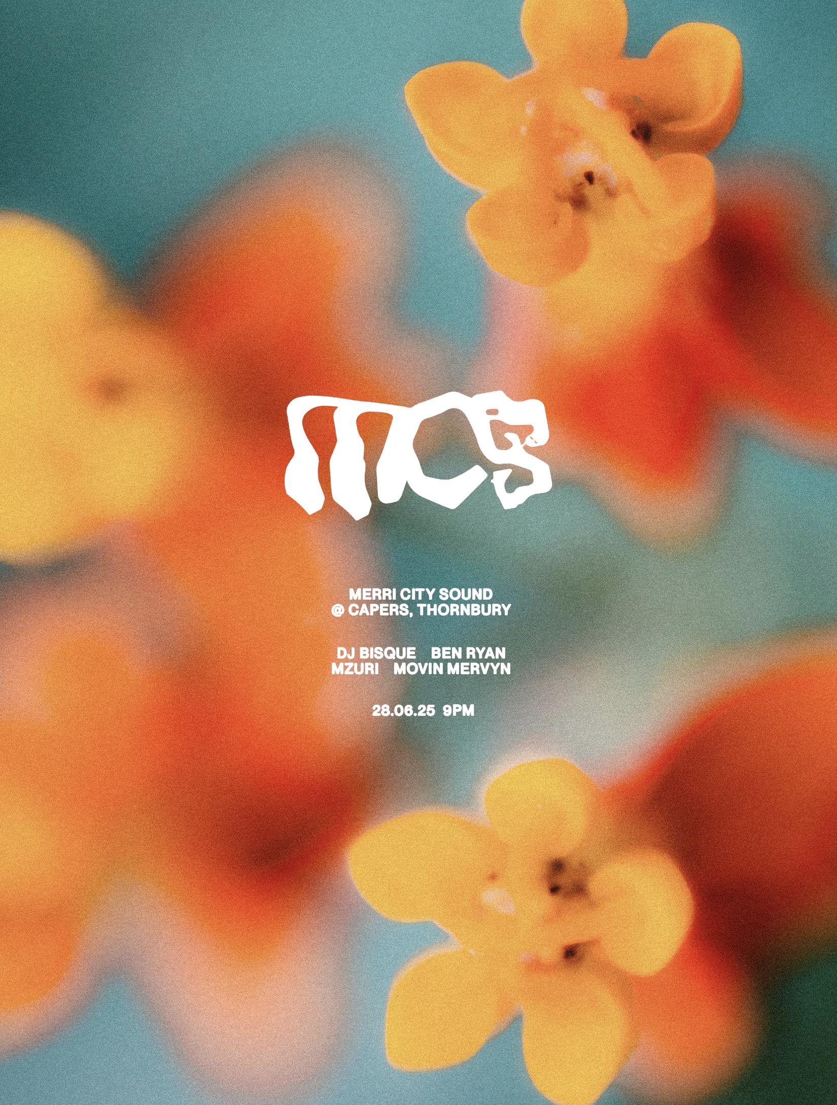
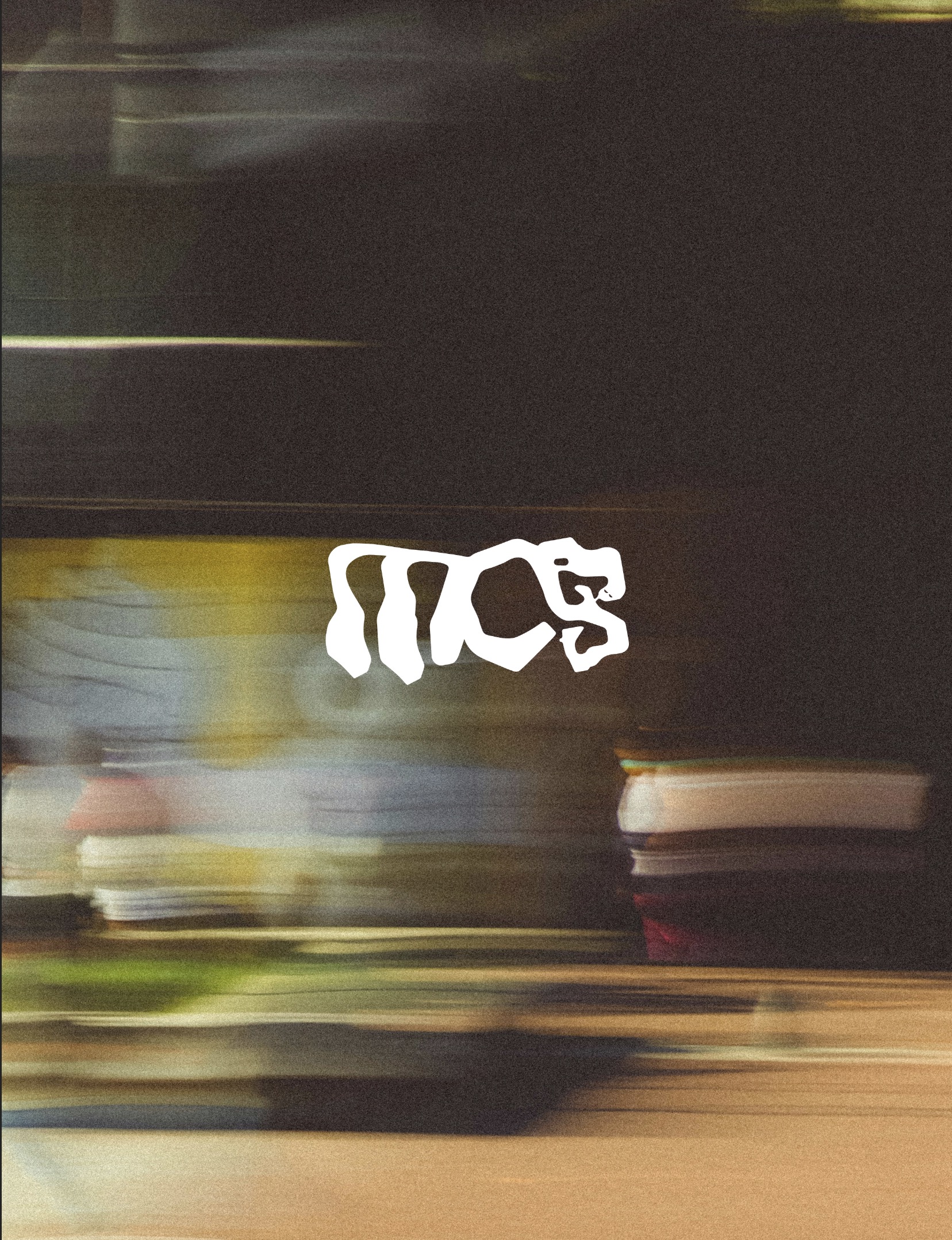
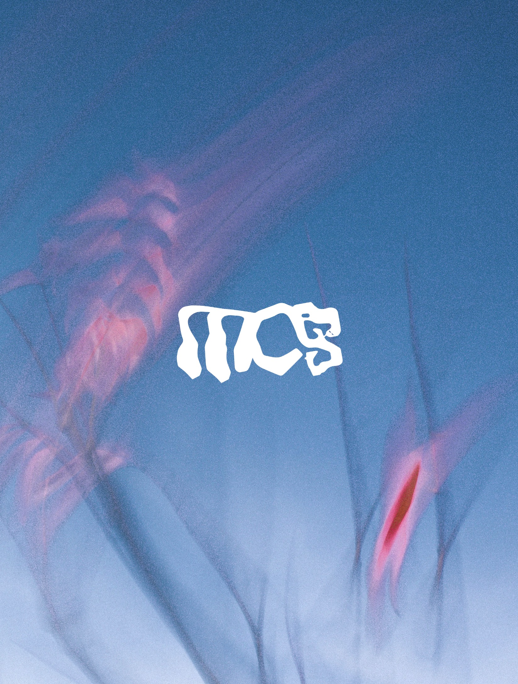
The broader visual direction balances two things: the earthy, local feeling of the neighbourhood, raw textures, grounded colours, a sense of place, and the bold, graphic energy of contemporary music industry design. The result is a brand that can live on a flyer at a local venue, on social media, or on a t-shirt, and feel credible in all three contexts. Built as a complete brand system: mark, wordmark, colour palette, typography, and application guidelines.
Outcome
A brand with roots. Literally.
- Designed the complete Merri City Sound brand identity from concept to final system
- Created an abstract letterform that embeds the Merri Creek and a subtle snake motif, connecting the brand to place and Indigenous history
- Balanced an earthy, local aesthetic with the bold graphic language of the modern music industry
- Delivered a full brand system: mark, wordmark, colour palette, typography, and application guidelines
- The rebrand gave the company a visual identity that finally matched the quality of the events we put on
Next Project
Telstra Satellite→